
Every modern business must establish an online presence that mirrors its unique brand identity and ensures an unparalleled user experience. Such a digital platform enables enterprises to widen their customer base and market their offerings in the most efficient and impactful manner. Achieving this requires a meticulously crafted website design process.
The specific needs of website development vary, influencing the roles and responsibilities of coders, designers, and developers. Despite these variations, there are universal steps in the web design process that are indispensable. In this article, I’ll delineate the seven crucial stages of crafting an SEO-optimized website, as perfected by KNRwebdesign. Join me as we explore these key phases, along with essential considerations for anyone embarking on the web design journey.
This guide unfolds the journey from the initial idea to the final realization of a website that meets SEO standards at KNRwebdesign. Follow me to grasp these critical steps thoroughly, equipped with insights crucial for anyone venturing into website design.
Step 1: Consulting and discussion
Understanding the aspirations and aligning with business owners is pivotal in the website design process. This requires both parties, KNRwebdesign and the business, to engage in one or more consultative discussions.
These discussions serve not just to align visions but also enable KNRwebdesign to address queries and provide guidance on crafting an SEO-optimized website effectively.
Embracing a philosophy of “rapid comprehension and immediate implementation,” KNRwebdesign is keen on collaborating with your business to:
- Pinpoint the essential resources of the website.
- Identify the key customer demographics your business aims to attract.
- Conduct a thorough market and competitor analysis to glean insights and address any gaps in your website’s strategy.
- Establish significant objectives to accelerate the growth of the website.
- Create clear guidelines to ensure business owners can closely follow and comprehend the website design and development journey.
Step 2: Sketching the website structure
Just as constructing a building starts with an architectural blueprint, so too does crafting a website begin with a structural sketch. This foundational step is crucial for laying out the digital architecture of your business’s online presence. Following the initial consultation, KNRwebdesign proceeds to draft a detailed outline, mapping out the future website’s structure to visualize its components and functionalities.
This phase encompasses several critical tasks:
- Optimizing the URL structure for brevity and compliance with web standards.
- Identifying key components unique to each business’s website, ensuring all necessary elements are incorporated.
- Brainstorming imagery that not only beautifies the interface but also enhances user experience.
- Determining the optimal content volume and strategic placement of keywords to align with standard website structures, aiming to eliminate user confusion.
Additionally, the design adheres to fundamental principles of website interface design, including:
- Navigation options, such as tabs for different pages, positioned prominently at the top of the page.
- The menu icon (☰), if used, located in the top left corner for easy access.
- A search bar featured at the top right corner to facilitate quick information retrieval.
- Useful links, including those to the “About” or “Contact” pages, positioned at the bottom of each page for user convenience.
This meticulous approach to structuring ensures a seamless, intuitive navigation experience, setting a solid foundation for the subsequent stages of website development.
Step 3: Brainstorming with Clients
Once the structural blueprint is drafted, KNRwebdesign presents it to clients for review, inviting feedback and facilitating a collaborative brainstorming session. This crucial dialogue serves as a cornerstone for refining the project, marking the culmination of mutual understanding between the design and development teams and the client. It’s a pivotal process that ensures the business’s vision is accurately translated into the digital domain.
During this stage, every facet of the website’s proposed design and functionality is open for discussion, aiming for a consensus that aligns with the client’s objectives and expectations. This includes, but is not limited to:
- Determining the website’s primary color scheme, balancing aesthetics with brand identity.
- Selecting fonts and sizes that enhance readability while reflecting the brand’s personality.
- Deciding on the color palette’s light and dark tones, ensuring visual comfort and content legibility.
This collaborative effort is vital for fine-tuning the website’s design, ensuring that the final product not only meets but exceeds the client’s aspirations and requirements.
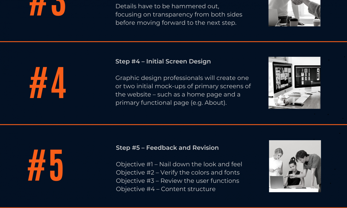
Step 4: Designing the wireframe
Following a detailed brief obtained from the brainstorming session, KNRwebdesign’s design team embarks on crafting the wireframe. This step transforms the conceptual discussions into a tangible visual representation, outlining the website’s basic structure. The wireframe serves as a blueprint, highlighting the placement of key elements and content across the site’s pages.
Subsequent to wireframe creation, a collaborative review session is held with the customer and the content team. This meeting is crucial for:
- Verifying the placement and volume of content: Ensuring that the text, images, and other media are optimally positioned for user engagement and SEO effectiveness.
- Finalizing the layout: Consolidating feedback to refine the wireframe, ensuring that the proposed design aligns with the client’s vision and user experience goals.
The wireframe phase is instrumental in bridging the gap between abstract ideas and the concrete structure of the website. It provides all stakeholders with a clear vision of the site’s architecture, facilitating adjustments before moving forward to the more detailed design stages.
When refining the design of your website, several key considerations play a pivotal role in enhancing user experience and aesthetic appeal:
Enhanced Navigation Options
Incorporating direct links to essential pages at the top of your homepage significantly aids first-time visitors in navigating to critical content effortlessly. This practice is a standard amongst web designers, designed to ensure that key information is immediately accessible.
Accessibility across your website is paramount. Every page should be easily reachable through navigation menus, not solely through direct URLs. This approach guarantees a seamless browsing experience for all users.
Harmonious Color Schemes
The art of web design, much like any design field, thrives on a palette of colors that complement each other beautifully. Selecting a theme that marries colors harmoniously is crucial for creating a visually cohesive experience. If uncertain where to begin, the classic combination of white, black, and gray never fails to create an elegant and sophisticated look.
Embracing Minimalism
The minimalist design, with its cool tones, simple graphics, and uncluttered text, is highly recommended for a clean and professional website appearance. This design philosophy focuses on the essentials, eliminating any superfluous elements to highlight your content and services effectively.
For those exploring design themes, many designers offer a selection of minimalist templates, providing an accessible route to achieving a sleek and modern website design.
Exploring Brutalism
As an alternative to minimalism, brutalism offers a bold approach with its use of stark lines, vivid colors, and minimal imagery. This design style, less conforming than minimalism, may align better with certain content types or brand identities, offering a distinctive and impactful user experience.
In the journey of web design, these considerations are instrumental in crafting a site that not only resonates with your brand identity but also ensures a user-friendly and aesthetically pleasing digital presence.
Step 5: Deploying the Prototype for the website
The next pivotal phase in the website design journey is the development of a prototype. This stage allows the designer to create a functional model of the website, working closely with developers to integrate desired movements and features into the interface.
At this juncture, while the core structure of the website remains established, there is room for iterative adjustments to the interface to maximize user satisfaction and align with the client’s vision.
Key Considerations During the Prototype Phase:
Embrace Unique Design Choices:
- Innovative Styles: While adhering to design norms provides safety, introducing unique elements and styles can inject personality into your website, making it stand out. Consider breaking the mold with asymmetrical layouts or layered elements for a fresh look.
- Element Shapes: Sharp, angular details can impart a sleek, modern feel, but don’t shy away from incorporating rounded elements for a softer, more approachable design. The choice between squared-off and rounded elements can significantly influence the aesthetic and user experience.
Optimize Image Usage:
- Load Times: With the critical role of imagery in web design, it’s essential to balance visual appeal with performance. An excessive number of images can slow down page loading times, potentially deterring visitors. Strive for a page load time of under four seconds to ensure accessibility and a positive user experience.
This prototype phase is crucial for refining the website’s functionality and aesthetic, offering a tangible glimpse into the final product. It’s an opportunity to fine-tune details, ensuring the website not only meets but exceeds expectations, ready for the final stages of development and launch.
Step 6: Review and Testing
By the time you reach this stage, the website is nearly ready to make its debut, boasting a quality that’s fit for public viewing. The emphasis of this phase is on rigorous testing, a crucial step to confirm that the website is fully functional and offers an optimal user experience. This process not only identifies any lingering issues but also allows for the timely rectification of errors identified during deployment.
Key Focus Areas During the Review and Testing Phase:
- Functionality Testing: Every feature on the website, from links to forms to search functionality, must be tested to ensure they operate as intended. This includes verifying that all interactive elements respond correctly to user inputs.
- User Experience (UX) Testing: This involves evaluating the site’s navigational structure and overall design to ensure that users can easily find what they’re looking for without frustration. A seamless UX is vital for keeping visitors engaged and encouraging them to return.
- Performance Testing: Assessing the website’s loading speed and responsiveness under various conditions is essential. High performance across devices and networks ensures that all users have a positive experience, regardless of their access point.
- Cross-Browser and Cross-Device Compatibility: The website should be tested across a range of browsers and devices to ensure consistent functionality and appearance. This guarantees that the site is accessible and enjoyable for a broad audience, including those on mobile devices.
- Security Testing: Ensuring that the website is secure against common vulnerabilities is critical to protect user data and maintain trust in your brand.
The review and testing phase is integral to the web design process, serving as the final checkpoint before launch. It ensures that the website not only looks good but also works well, providing a foundation for a successful online presence.
Quality Assurance
At this pivotal juncture, the website undergoes meticulous scrutiny to ensure it meets the highest standards of performance and user experience. Testing is paramount to guarantee functionality and iron out any imperfections before deployment.
With the completion of step 6, your website is on the brink of completion, boasting quality craftsmanship ready for public display. Rigorous testing procedures are instrumental in fine-tuning the website, fostering seamless navigation and enhanced user engagement.
Key Considerations During Inspection:
Mobile Optimization:
- Mobile-Friendly Design: Given the prevalence of mobile browsing, prioritizing mobile optimization is imperative. The mobile version of your website should receive equal attention to detail as the desktop version.
- Button Accessibility: Ensure that buttons are sufficiently large and easy to tap on mobile devices, facilitating effortless navigation and interaction.
- Feature Compatibility: Avoid incorporating features incompatible with mobile devices, such as Flash or Java, to ensure seamless functionality across all platforms.
- Consider Mobile Apps: For enhanced user experience, contemplate developing a dedicated mobile app alongside your website, providing a tailored experience for mobile users.
The thorough examination conducted during this stage sets the foundation for a flawless website experience, catering to the diverse needs of users across different devices. By prioritizing mobile optimization and adhering to best practices, your website is poised to deliver unparalleled performance and user satisfaction.
Enhance User Experience with a Search Bar
Incorporating a search bar into your website design can significantly enhance user experience by providing a convenient and efficient way for visitors to find specific information. Here’s why you should consider integrating a search bar into your website building process:
- Facilitates Accurate Navigation: A search bar empowers users to quickly locate desired pages or items without having to navigate through menus or categories. This streamlines the user journey and saves valuable time.
- Improves User Engagement: By enabling users to search for specific terms, the search bar encourages active participation and engagement with your website content. Visitors are more likely to stay on your site longer if they can easily find what they’re looking for.
- Reduces Friction: Users who are unable to locate desired information may become frustrated and abandon your site. A search bar minimizes friction by providing a direct path to relevant content, enhancing overall user satisfaction.
- Enhances Usability Across Devices: Whether users are accessing your site on desktops, laptops, or mobile devices, a search bar offers a consistent and intuitive means of navigation. This ensures a seamless user experience regardless of the device being used.
Recommendation: If your website’s structure supports the integration of a search bar, it is highly recommended to incorporate this feature. Doing so will empower users to quickly and effortlessly find the information they seek, enhancing overall usability and satisfaction.
By implementing a search bar, you demonstrate a commitment to user-centric design and provide a valuable tool that enhances the accessibility and usability of your website.
Maximize Impact with Your Homepage
Your homepage serves as the gateway to your website, making it essential to invest in its design and functionality. Here are key aspects to consider when optimizing your homepage:
- CTA – Call to Action: Incorporate a clear and compelling call to action (CTA) that prompts visitors to take desired actions, such as making a purchase, signing up for a newsletter, or contacting your business. Whether it’s a prominent button or a form to fill out, the CTA should guide visitors towards valuable interactions.
- Navigation Bar or Menu: Ensure easy navigation by including a well-organized navigation bar or menu. This allows visitors to explore different sections of your website effortlessly and find the information they need. Keep the menu concise and intuitive to enhance usability.
- Attractive Visuals: Capture visitors’ attention with visually appealing elements, such as high-quality images, videos, or multimedia content. These visuals should align with your brand identity and effectively communicate your message. Consider using captivating imagery or multimedia sliders to showcase your products, services, or brand story.
- Keyword Optimization: Strategically incorporate relevant keywords related to your business, services, or products into the content of your homepage. This helps improve search engine visibility and ensures that your website ranks well for relevant searches. Integrate keywords naturally within headings, paragraphs, and metadata for optimal SEO performance.
Why Invest in Your Homepage?
- First Impressions Matter: Your homepage is often the first point of contact for visitors, shaping their initial impression of your brand. A well-designed and informative homepage creates a positive user experience and encourages further exploration of your site.
- Drive Conversions: By including compelling CTAs and guiding visitors towards meaningful actions, your homepage can serve as a powerful conversion tool. Whether it’s making a purchase or contacting your business, a strategically designed homepage can drive desired outcomes.
- Enhanced Brand Visibility: Optimal homepage design and keyword optimization contribute to improved search engine rankings, increasing your brand’s visibility and attracting more organic traffic. This positions your business as a trusted authority in your industry and drives brand recognition.
Investing in your homepage ensures that it effectively communicates your brand message, engages visitors, and drives conversions, ultimately contributing to the success of your online presence.
Ensure Compatibility Across Browsers and Platforms
Testing your website on various browsers and platforms is crucial to ensure optimal performance and compatibility. Here’s a checklist of browsers and platforms to test your website on before launching:
- Google Chrome: Chrome is one of the most widely used web browsers across different platforms, including Windows, Mac, iPhone, and Android. Test your website’s functionality, layout, and responsiveness on Chrome to ensure a seamless user experience.
- Mozilla Firefox: Firefox is another popular browser with a significant user base. Check how your website renders and functions on Firefox to identify any compatibility issues or discrepancies in rendering.
- Safari: Safari is the default browser for Apple devices, including iPhones and MacBooks. Test your website on Safari to ensure compatibility with Apple’s ecosystem and optimize the user experience for iOS and macOS users.
- Microsoft Edge and Internet Explorer: While their usage has declined, some users still rely on Microsoft Edge and Internet Explorer, especially on Windows platforms. Validate your website’s performance on these browsers to cater to a wider audience and ensure accessibility for all users.
- Built-in browsers on Android devices: Android devices come with built-in browsers that may vary depending on the device manufacturer. Test your website on popular Android browsers like those found on Samsung Galaxy and Google Nexus devices to ensure compatibility across different Android platforms.
Why Browser and Platform Testing Matters
- Consistent User Experience: Ensuring your website functions smoothly across various browsers and platforms helps deliver a consistent user experience to all visitors, regardless of their device or browser preference.
- Maximize Reach: By testing on different browsers and platforms, you can maximize your website’s reach and accessibility, ensuring that it caters to a diverse audience and remains accessible to users across various devices.
- Identify Compatibility Issues: Testing allows you to identify and address compatibility issues or rendering discrepancies that may affect user experience. By proactively addressing these issues, you can prevent potential frustration for visitors and improve overall satisfaction.
By thoroughly testing your website on different browsers and platforms, you can address compatibility issues, optimize user experience, and ensure that your website performs seamlessly across various devices, ultimately enhancing its effectiveness and reach.
Step 7: Launching the website
The culmination of the website design process is the launch of your fully developed website. However, this step entails more than simply unveiling your accomplishments to the world; it requires careful planning and execution of a comprehensive communication strategy.
Crafting a Communication Plan
A well-thought-out communication plan is essential for the successful launch of your website. Consider the following aspects when devising your strategy:
- Timing: Determine the optimal time to launch your website based on factors such as target audience behavior, market trends, and promotional activities. Aim for a time when your audience is most likely to be engaged and receptive.
- Media Channels: Identify the most effective media channels for promoting your website launch. This may include social media platforms, email newsletters, press releases, and online communities relevant to your industry or niche.
- Messaging: Develop compelling messaging that highlights the unique features, benefits, and value proposition of your website. Clearly communicate what sets your website apart and why visitors should engage with it.
- Promotional Campaigns: Plan and execute promotional campaigns to generate buzz and excitement around your website launch. Utilize various marketing tactics such as contests, giveaways, exclusive offers, and influencer partnerships to attract attention and drive traffic to your site.
- Website Accessibility: Ensure that your website is accessible to users immediately upon launch. Test its functionality across different devices, browsers, and screen sizes to guarantee a seamless user experience for all visitors.
- Feedback Mechanism: Set up mechanisms for collecting feedback from users after the website launch. Encourage visitors to provide their insights, suggestions, and comments, and use this feedback to continuously improve and refine your website.
Conclusion
In conclusion, the website design process involves seven essential steps that are crucial for creating a comprehensive and effective website. By following these steps, you can ensure that your website reflects your brand identity, meets the needs of your target audience, and delivers an exceptional user experience.
If you’re embarking on the journey of building a business and require assistance with designing a complete website, feel free to reach out to KNRwebdesign. Our team of experts is dedicated to providing top-notch website design services tailored to your specific requirements.
Additionally, if you’re aspiring to kickstart your career as a Front End developer, consider applying for an internship opportunity at KNRwebdesign. Our Front End WordPress intern recruitment form for 2021 is now open, offering valuable hands-on experience and learning opportunities in the field of web development.
We look forward to assisting you in creating a dynamic and engaging website or supporting your professional growth as a Front End developer. Contact us today to get started on your journey towards digital success.